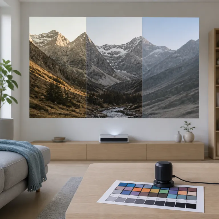
Why projector calibration settings matter more than the spec sheet
Most home cinema projectors ship with picture modes tuned to punch through harsh showroom lighting, not to deliver accurate images in your living room. When you rely on factory presets, you leave a huge amount of potential image quality locked away, especially in how brightness, contrast and color interact on your screen. Thoughtful projector calibration at home lets the hardware you already own behave like a far more expensive display by targeting reference standards instead of marketing demos, following guidelines such as ITU‑R BT.709 for color and SMPTE recommendations for luminance.
Think of your projector as a lens on your content, where every setting either preserves or distorts the original signal. The goal is not a punchy demo look but a calibrated projector image that tracks reference standards such as a D65 white point and Rec.709 color for SDR, so skin tones, shadow detail and highlights appear natural rather than exaggerated. With a few careful adjustments to brightness, contrast, gamma and color temperature, you can ensure that both dark dramas and bright animation look consistently high quality at around 14–18 ft‑L (roughly 50–65 cd/m²) on the screen, in line with common home theater targets derived from SMPTE RP‑166.
Good projector calibration settings also protect you from marketing traps around inflated lumen claims and vague HDR promises. Instead of chasing the brightest mode, you tune brightness and contrast to your actual projector screen size and ambient light level, which stabilizes your viewing experience across different content. Done right, simple calibration tools, SMPTE/PLUGE style test patterns and basic meters such as an X‑Rite i1Display Pro or Datacolor Spyder give you a repeatable process you can apply to multiple projectors over time, with DIY results often landing within a Delta‑E of 3–5 for grayscale and color when checked in software like HCFR or CalMAN.
Choosing the right picture mode and preparing the room
The single biggest decision you make in projector calibration settings is your starting picture mode. On most projectors, the mode labeled Cinema, Movie or Filmmaker is closest to reference, while Vivid or Dynamic modes push blue color temperature, crush gamma and exaggerate sharpness. Begin with the most accurate mode, set color temperature to Warm or 6500 K, then refine individual settings rather than trying to tame an overcooked preset that was never designed for critical viewing or Rec.709 accuracy.
Before you calibrate projector controls, prepare space and room conditions so they match how you actually watch movies. Close curtains, dim stray light sources and note how much ambient light remains on the projector screen, because that will dictate whether you target a gamma of 2.2 for mixed lighting or 2.3–2.4 for a dark room. A stable environment lets you judge subtle changes in color accuracy, brightness, contrast and shadow detail without chasing reflections on the display or compensating for changing light levels, which is essential when you are trying to follow BT.1886 or 2.2 gamma curves by eye.
Room setup also includes physical alignment, which many first time buyers underestimate when thinking about calibration. Use lens shift instead of keystone correction whenever possible, because digital keystone softens the image and undermines any work you do on sharpness and focus. If you must use keystone correction on portable projectors, keep the adjustment minimal and recheck focus at the center and edges of the screen to ensure uniform clarity and avoid geometric distortion that no calibration can fully fix.
HDR adds another layer of complexity, because tone mapping choices can radically alter perceived image quality. If you want a deeper dive into why the same UHD disc looks different on two projectors, read a detailed guide on HDR tone mapping behavior across projector models and how they map PQ EOTF to limited projector brightness. Understanding how your projector handles HDR helps you choose the right picture mode, gamma or EOTF combination and color gamut option (Rec.709 vs DCI‑P3) for both SDR and HDR content, and lets you aim for realistic HDR peak levels around 80–120 nits on typical home theater screens instead of chasing unattainable 1000‑nit mastering values.
Brightness, contrast and gamma: the foundation of a calibrated image
Once the room and picture mode are set, brightness and contrast are the first real levers in projector calibration settings. Brightness controls the black level, or how dark the darkest visible detail appears, while contrast sets the peak white level, or how bright highlights can get before clipping. Adjusting these two with proper test patterns is what unlocks real image quality, not just a brighter picture, and it sets the stage for accurate gamma and color reproduction that aligns with Rec.709 and BT.1886 expectations.
Use free test patterns or a calibration disc that includes dedicated brightness and contrast ramps, PLUGE bars and near black steps. Raise brightness until the first above black bar is barely visible, then lower contrast until the brightest bars are distinct without merging into a single block of white, which ensures you see both shadow texture and highlight detail. This process works on lamp based and laser projectors alike, though laser light engines often hold peak output more consistently over time, so you may recalibrate them less frequently and see less drift in your measured ft‑L or cd/m² readings.
Gamma is the quiet hero of projector calibration, because it shapes how mid tones transition between black and white. In a room with some ambient light, a gamma of 2.2 keeps mid tones from looking washed out, while a darker dedicated space benefits from 2.3 to 2.4 to deepen contrast without crushing shadows. If your projector offers multiple gamma presets, flip between them on a familiar scene with faces and dark backgrounds to judge which curve preserves both skin tones and low level detail while matching the intended BT.1886 or 2.2 target, and confirm with a stepped grayscale pattern if you have access to calibration software.
Motion settings sit alongside gamma in the same menu on many projectors, and they deserve a quick pass. Frame interpolation can make movies look like video, but a low setting sometimes helps sports and animation without ruining the cinematic feel. Gamers should also check input lag and features like VRR or ALLM, and a clear breakdown of gaming projector input lag and VRR specifications explains how those modes interact with picture processing, sometimes disabling certain noise reduction or motion options that would otherwise affect perceived sharpness and response.
Color temperature, white balance and sharpness traps
After the grayscale backbone is in place, color temperature and white balance determine whether the image feels natural or strangely tinted. The reference target for home cinema is D65, roughly 6500 K, which gives neutral whites and believable skin tones when the rest of the calibration is sound. On many projectors, the Warm or Cinema color temperature preset sits closer to D65 than Neutral or Cool, which often skew too blue and push the image away from Rec.709 reference and the intended creative look.
Without calibration tools or calibration software, you can still refine white balance by using test patterns that show grayscale steps from black to white. If the darker steps look greenish or reddish compared with the mid tones, your projector’s two point or multi point white balance controls can gently nudge red, green and blue gains to restore color accuracy. Make small changes, then recheck real content with faces, clouds and neutral walls to ensure the adjustments hold up outside synthetic patterns and keep average grayscale Delta‑E under about 5 for casual viewing, even if you are only verifying results with a basic meter and free HCFR charts.
Color calibration also includes the saturation and tint controls, but those are easier to damage than improve without a meter. For most users, leaving global color at its default in the Cinema mode and focusing on color temperature yields a more reliable viewing experience than chasing perfect primaries by eye. Where you should intervene aggressively is sharpness, because factory defaults are usually too high and add halos around edges that make the image look processed rather than genuinely high quality.
Turn sharpness down until the white outlines around text and fine lines in test patterns disappear, then slowly raise it until detail snaps into focus without obvious ringing. On 4K projectors, especially those using pixel shift like many Epson models, extra sharpness and enhancement controls can exaggerate noise and grain, so err on the side of restraint. If your projector includes a Pro or Detail Enhancement mode, test it with both animation and live action to ensure it helps real texture instead of just boosting noise, and remember that true resolution comes from focus and alignment, not artificial edge enhancement or aggressive image processing.
Focus, screen choice, light source and when to go pro
Optical focus is the most basic part of projector calibration settings, yet it is often rushed. Stand close to the projector screen and use a focus pattern or a paused subtitle track to dial in clarity at the center, then check the corners to ensure the lens is not introducing uneven sharpness. If the edges never quite match the center, you may be pushing the zoom range too far for that projector and screen combination or dealing with lens limitations that no electronic sharpening can fully hide.
Screen material and size also shape perceived contrast, color and brightness, especially in rooms with ambient light. A larger screen demands more light output from the projector, which can force you into a brighter but less accurate picture mode, while a smaller screen lets you run the lamp or laser in a lower power setting that improves black levels and fan noise. Ambient light rejecting screens can help in bright rooms, but they also interact with viewing angles and color, so always judge image quality from your main seats and aim to keep SDR brightness in the 14–18 ft‑L window (about 50–65 cd/m²) measured at the screen surface.
Light source type matters for long term calibration stability, because lamp based projectors dim and shift color faster than laser models. If you are curious about how long laser projectors actually maintain their brightness and color balance, an analysis of laser projector lifespan and failure modes explains what really changes over thousands of hours. Portable projectors complicate things further, since their smaller optics, aggressive keystone correction and limited calibration tools make precise color calibration harder, but the same principles of gamma, brightness and focus still apply even if you cannot fully hit Rec.709 or tight Delta‑E targets.
At a certain point, DIY calibration hits its ceiling, especially with high quality projectors above roughly two thousand dollars that can resolve fine differences in color and contrast. An ISF or THX certified calibrator using professional calibration software, a colorimeter or spectrophotometer and advanced test patterns can align grayscale, color gamut and gamma far more accurately than the eye, which is worthwhile if you have invested in a serious display and a good projector screen. Think of it as the final tune on a well set up system, where your careful work on room, settings and patterns lets the professional focus on precision rather than basic fixes, often tightening color gamut tracking to within a Delta‑E of 1–2 and documenting how closely you meet Rec.709, BT.1886 or DCI‑P3 targets.
FAQ
Do I need expensive calibration tools to improve my projector image?
You can make substantial gains in image quality without buying dedicated calibration tools. By choosing the right picture mode, adjusting brightness and contrast with free PLUGE style test patterns and setting gamma appropriately for your room, you address the biggest errors. Professional meters and calibration software refine color accuracy, white balance and color gamut tracking further, but they are not mandatory for a satisfying viewing experience if you are content with approximate Rec.709 and Delta‑E values under about 5, verified occasionally with an entry level colorimeter and free HCFR or similar utilities.
What gamma setting should I use in a living room with some light?
For a mixed use living room with moderate ambient light, a gamma setting around 2.2 usually offers the best balance between shadow detail and overall contrast. This keeps mid tones from looking washed out while preventing dark scenes from turning into a murky mess. In a fully dark dedicated room, moving to 2.3 or 2.4 deepens blacks and adds perceived contrast without losing important detail, especially when combined with a screen brightness near 16 ft‑L for SDR, which corresponds to roughly 55 cd/m² and sits comfortably within common home theater recommendations.
Is keystone correction bad for projector calibration?
Keystone correction is useful when you cannot place the projector square to the screen, but it always comes with trade offs. Digital keystone scales and warps the image, which reduces sharpness and can introduce artifacts that no amount of calibration can fully remove. Whenever possible, use physical placement and lens shift to align the projector, then reserve keystone for small corrections only so that focus, resolution and color uniformity remain as intact as possible.
How often should I recalibrate a lamp based projector?
Lamp based projectors gradually lose brightness and can shift color as the lamp ages, especially after the first few hundred hours. A practical schedule is to revisit brightness, contrast and gamma every six months of regular use, then check color temperature and white balance annually. If you notice the image looking noticeably dimmer or warmer, that is a good cue to recalibrate or consider a lamp replacement, and a quick meter check can confirm whether your SDR brightness has fallen well below the 14–18 ft‑L range or your grayscale tracking has drifted away from D65.
When is professional calibration worth paying for?
Professional calibration makes the most sense once you have invested in a higher end projector and a decent projector screen, and you care about accurate color and consistent performance. Above roughly two thousand dollars, many projectors include advanced controls that only a trained calibrator with proper meters can fully exploit, tightening grayscale, gamma and color gamut to near reference. If you have already optimized room light, placement and basic settings, a professional visit can lock in reference level performance for years and document before/after measurements so you know exactly how close you are to Rec.709 or DCI‑P3 targets, as well as how your HDR tone mapping tracks the PQ EOTF curve.